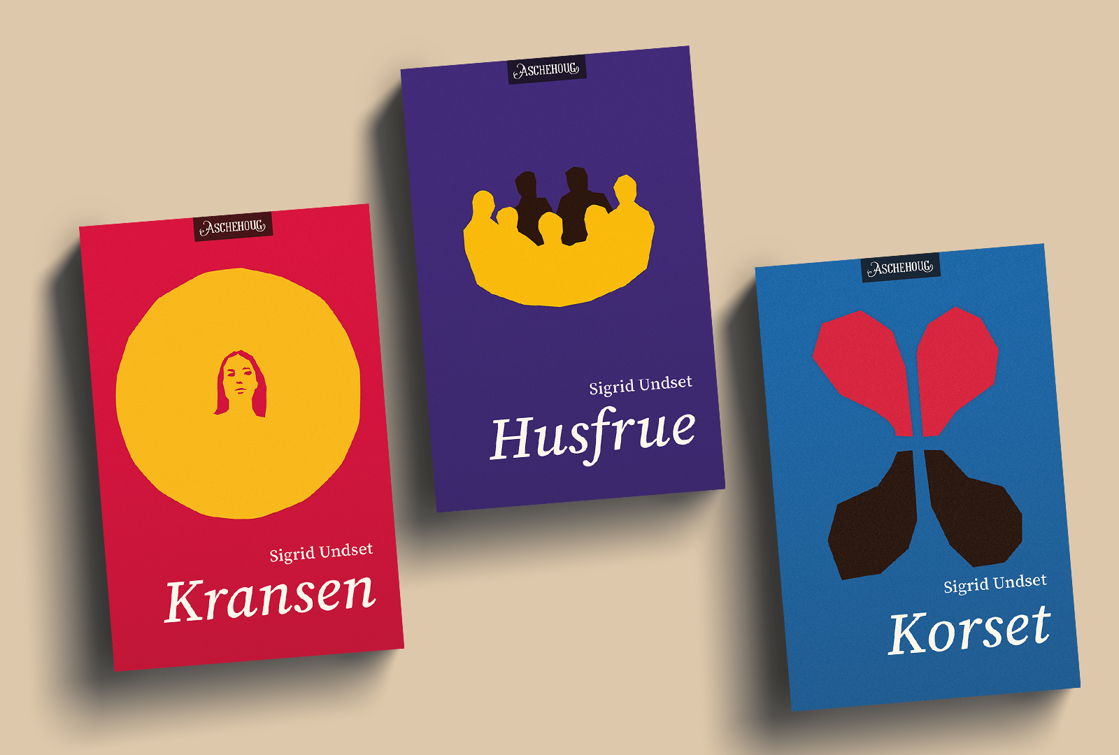
I wanted to set myself a design challenge to design book covers for this classic by Nobel Prize winning author Sigrid Undset. Set in medieval Norway but written during the years 1918–20, I wanted to modernise and highlight the universal human experiences the books describe, that go beyond religion and historical time periods. Strategically thinking, I wanted the designs to appeal to young readers and others who are not familiar with the work.
The books take us through the life of Kristin, from her birth in the first book to her death in the third. The colour of red, often represented Earth in art of the Middle Ages. Violet used for the second book was the colour of Kristin's wedding dress, and blue on the third book represents heaven.
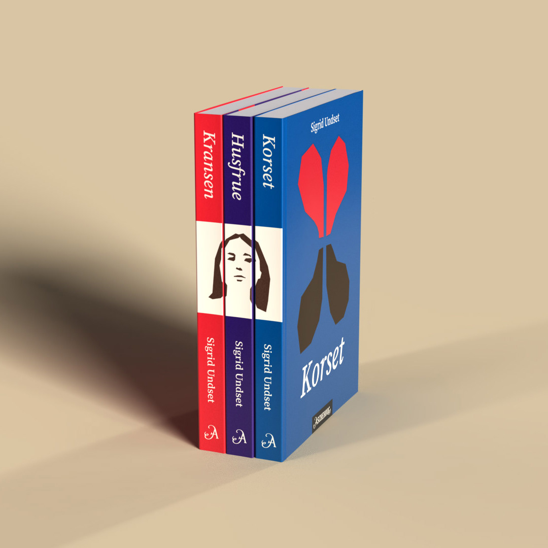
Dividing the books into three separate novels as they were originally published, makes sense in order to attract new readers, who might feel overwhelmed by reading such a voluminous book as they are when collected into one book. The three spines that form an image when placed in a book shelf also contributes to making the three books desirable to collect as a set.
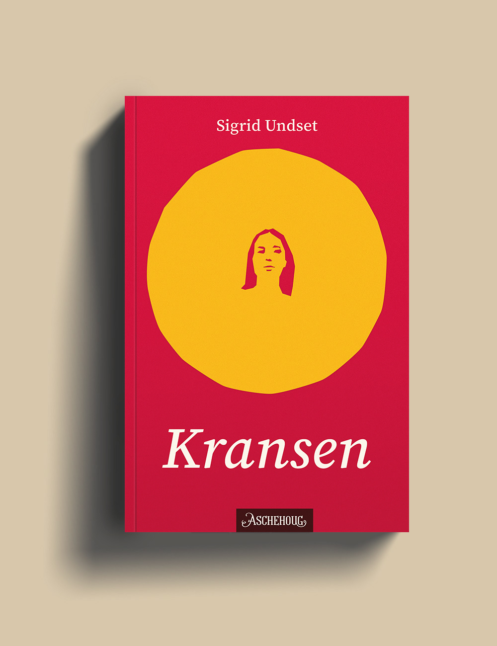
The Wreath
The main character Kristin is depicted as small in size compared to the circle that represents the wreath. The wreath symbolises the struggles Kristin experiences in order to live up to the expectations placed on her.
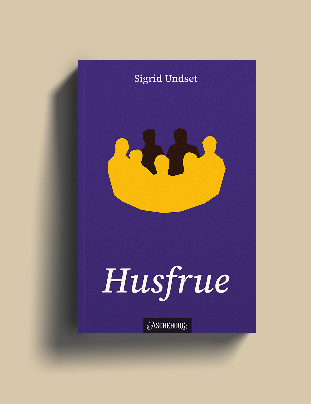
The Wife
Kristin had seven sons, which take up most of her attention in this book. They are presented in the shape of a crown, representing Kristin's bridal crown.
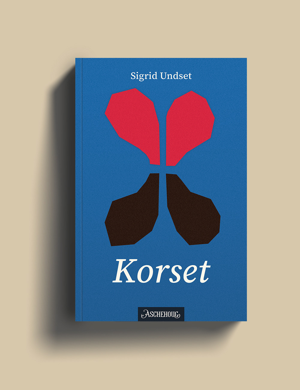
The Cross
The Black Plague arrives. The shapes alludes to prominant themes in the book such as duality, death and love
(The publisher Aschehoug own the rights to these books, and the logos are placed on the covers to create a more realistic design challenge. The designs are a purely self-initiated project for my own practice.)