Riot Hook Records is a DIY music production company who needed a re-brand. They wanted the logo to reflect the DIY nature of the company, whilst at the same time having a level of professionalism and consistency in their presentation. They mainly wanted logos to be printed on tshirts and stickers but also social media avatars.
A tshirt-first approach
Rather than a mobile first approach where simplicity is an important quality we decided on a more complex and messy, hand-made look.
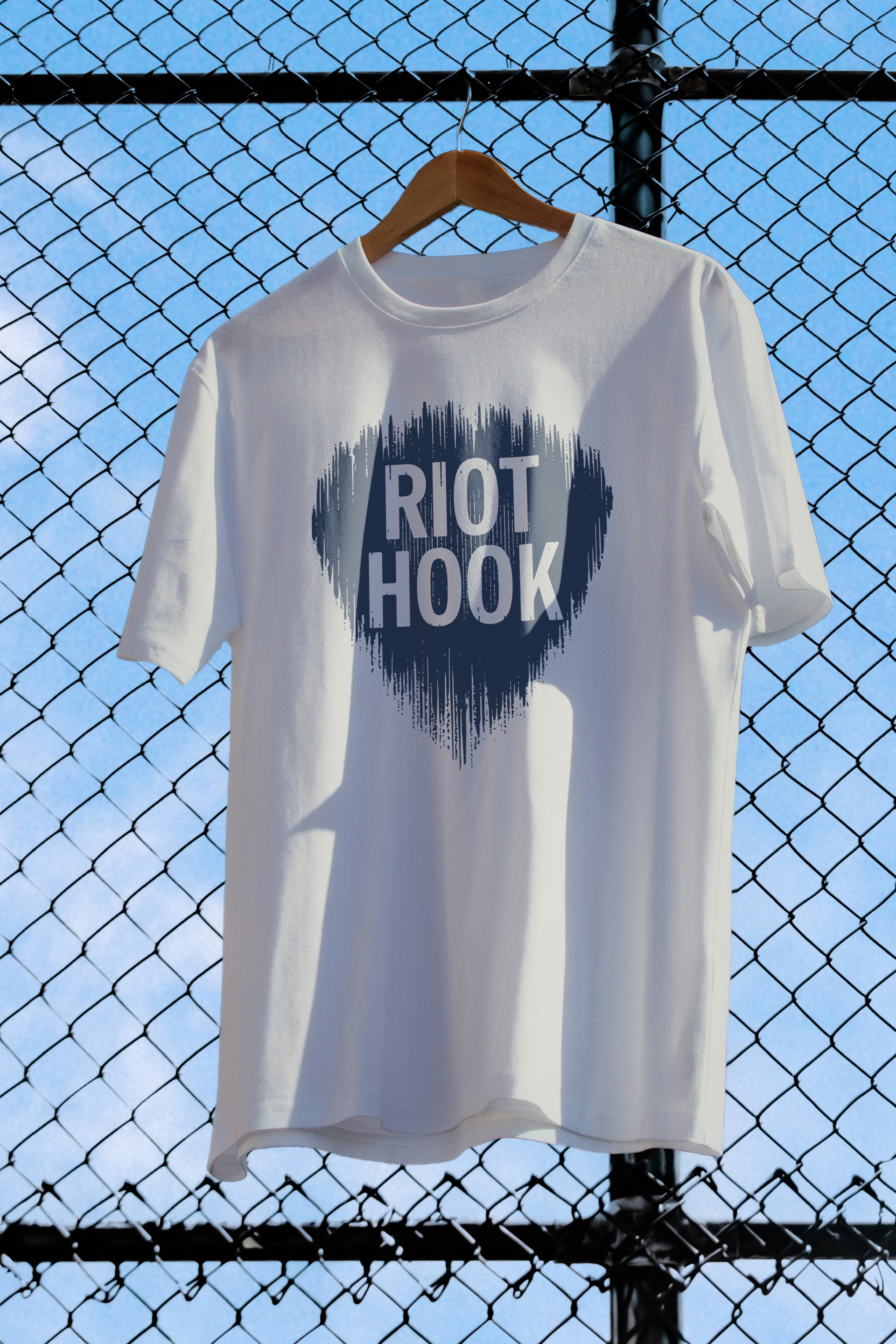
The logo was created with the t-shirt in mind – fitting a portrait format, expressive and detailed.
Riot Hook is a big proponent of physical media and artifacts. Nourishing a real connection with their followers, they stay in touch via paper newsletters.
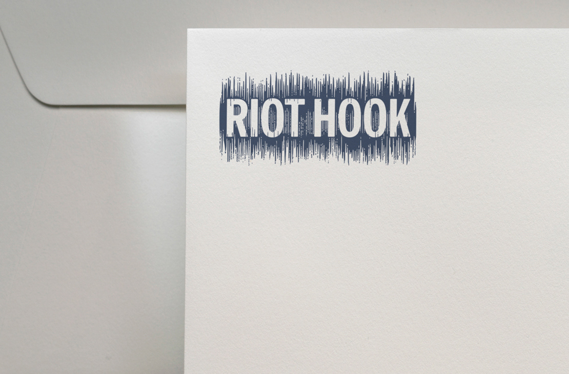
The hand-made look of the logo come to life on paper such as stationery and stickers.
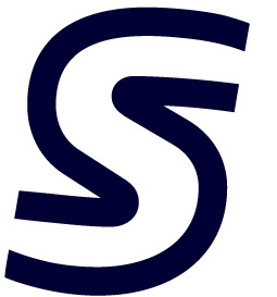
We decided it would be very useful to have one horizontal version of the logo, that represents a soundwave and to use the soundwaves to create a guitar pick for the vertical variant of the logo. This way the variant that suits the given space the best can be used.
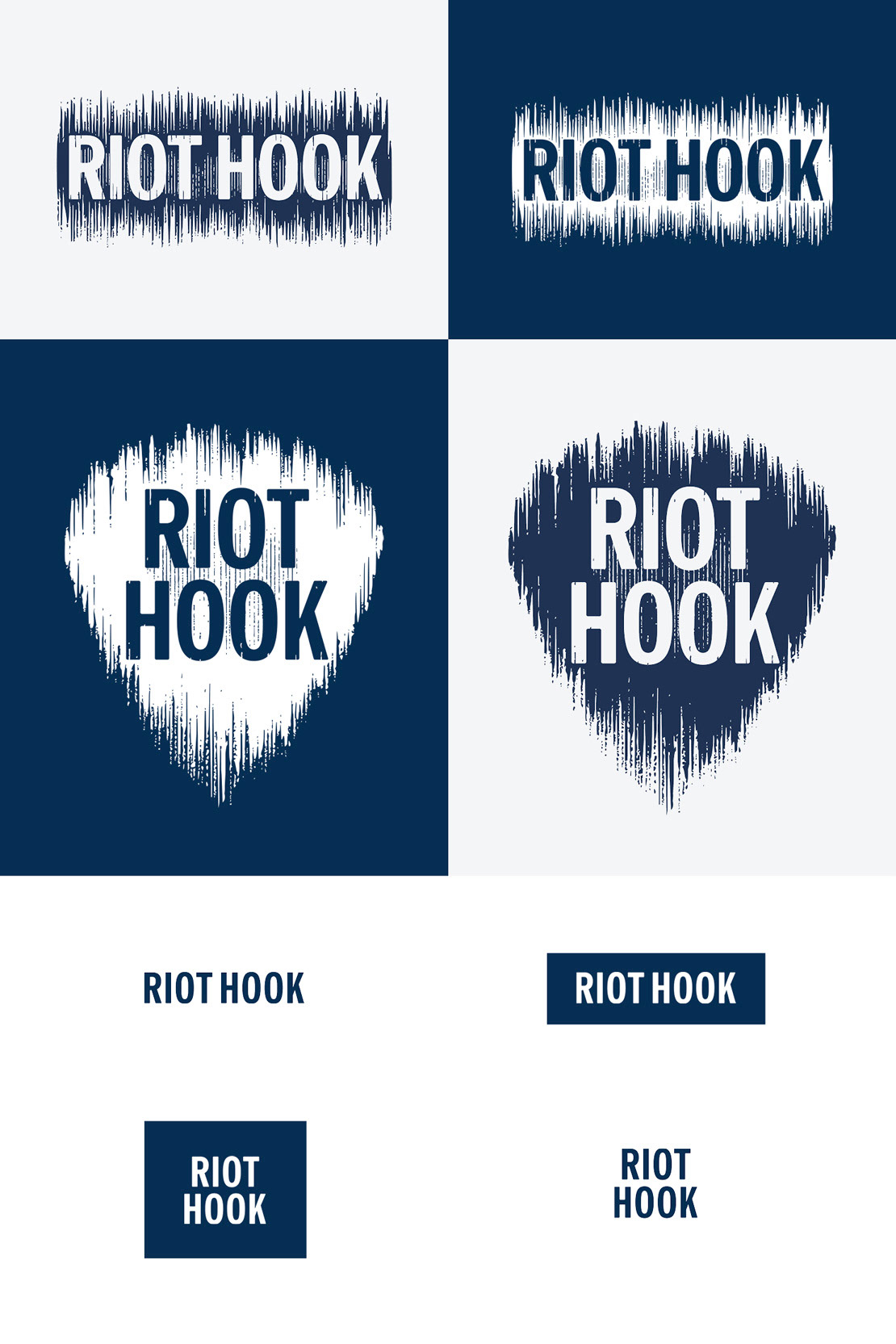
Together, the horizontal and vertical variants for both large and small sizes create a flexible logo suite
As well as the full-size vertical and horizontal variants of the logo, simplified variants were also created. These simple logo variants can be used in small spaces and on challenging surfaces.